Turbofan Engine Diagnostics
What if maintenance techs could predict engine issues before they happened?
Problem
The diagnostics UI had not been updated in over a decade.
What is the scariest thing that can happen when you’re on a plane?
While engine failures are rare, the tools that maintenance techs use to maintain and fix issues are vital to keeping those failures rare. My team had to redesign some legacy diagnostics software to modernize the software, facilitate data transfers from new hardware, and improve usability in order to help users make decisions on aircraft dispatch and engine health.
Our team not only built the desktop web app but we also created the supplementary mobile app for iOS and Android too.

My Role
I was the lead UX resource on this 18-month project and I:
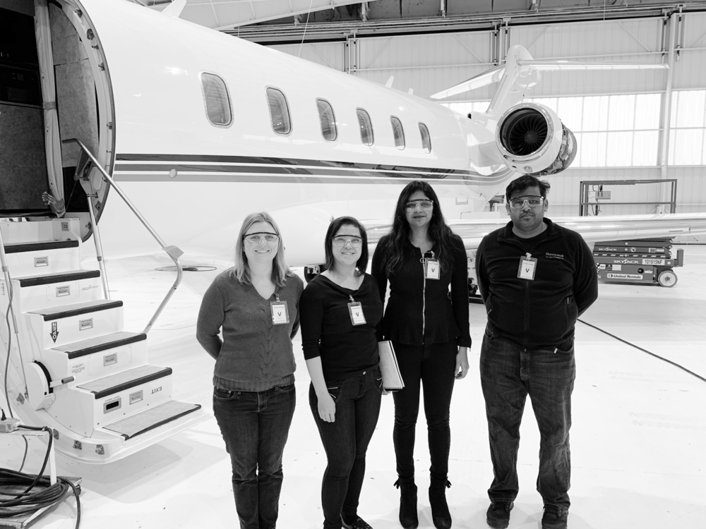
Conducted product discovery, field studies, subject matter expert interviews, and user interviews to understand the personas, tasks, and workflows
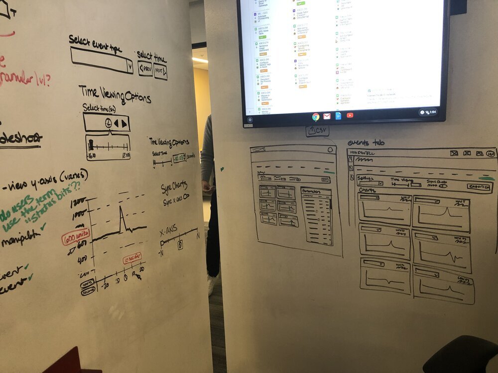
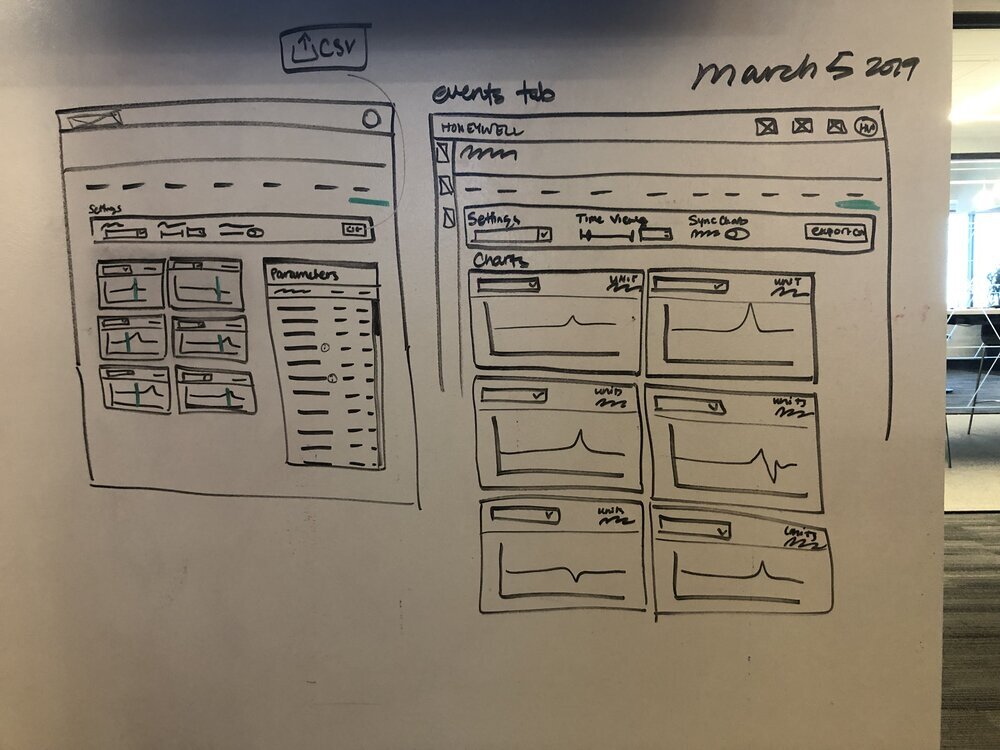
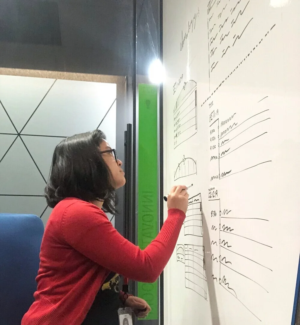
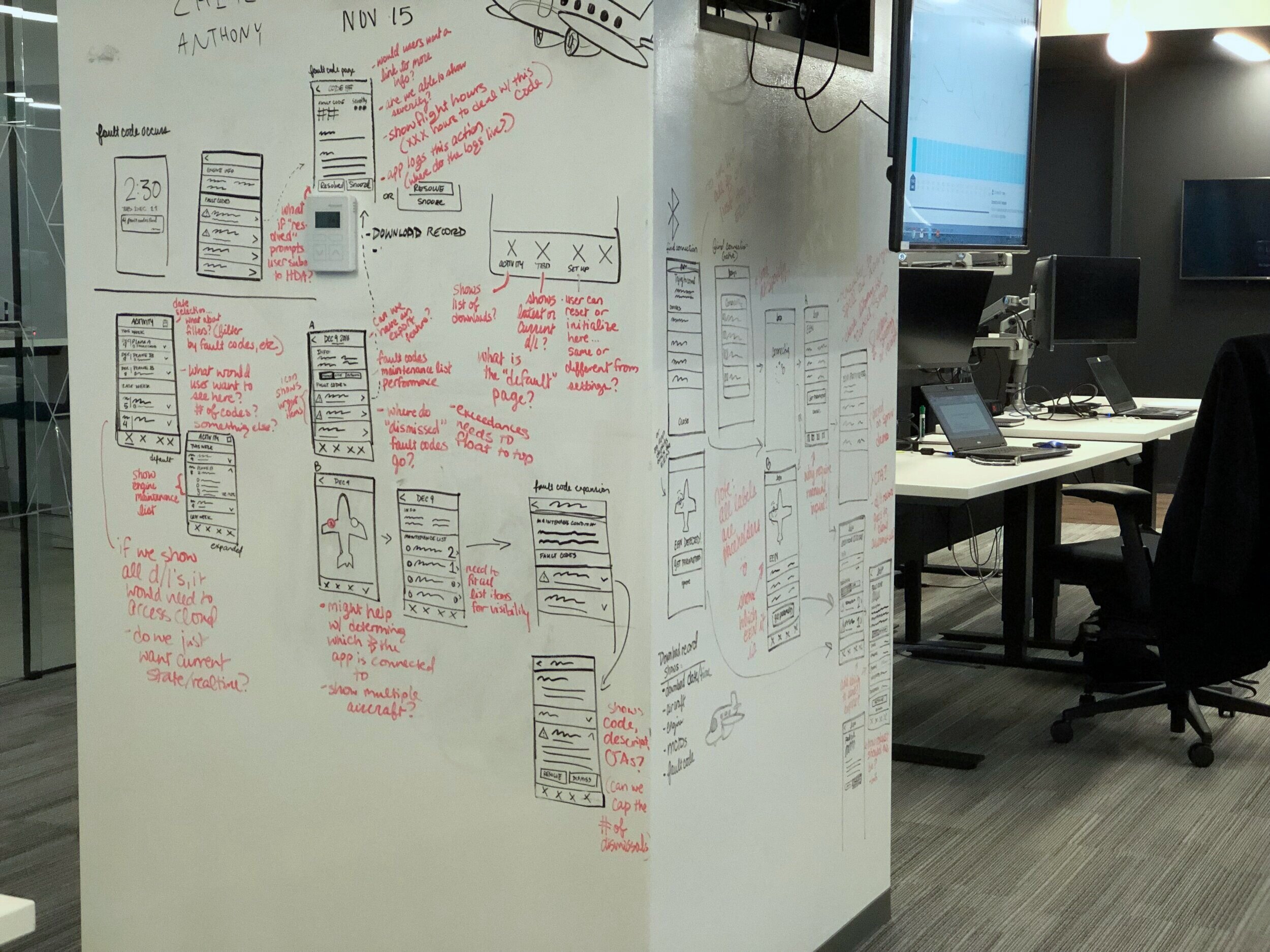
Created prototypes and wireframes with the help of engineering and SMEs
Validated prototypes through user testing and gained approval from stakeholders through mid-sprint reviews (Later, I got to collaborate with a new UX Research resource on this)
Created high-fidelity design mockups using company design system for desktop, tablet, and mobile
User-tested additional functionality for FAA compliance
Unique Challenges
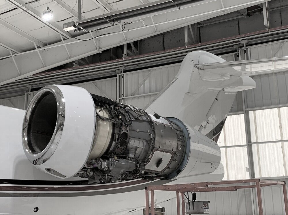
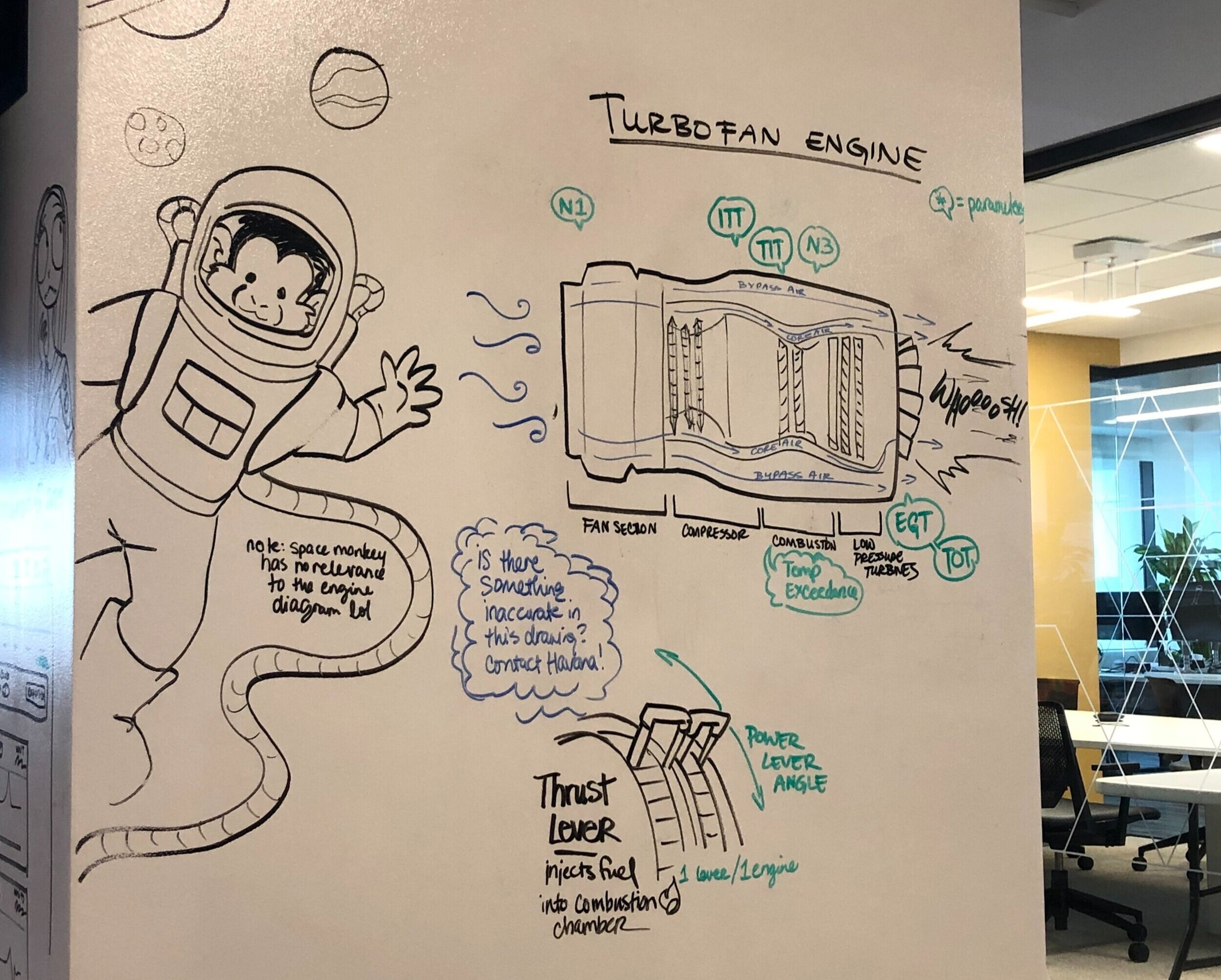
Um. It’s a turbofan engine. LOL It’s complex as hell.
Deep procedural memory. The legacy software our customers used had not been updated for decades. Think about that. Having used this program for over 20 years, our users’ brains probably have literal neural pathways specifically formed around the legacy interface. Even slightly changing a single link disrupted their procedural memory and bewildered them. As a result, we had to be very conservative with UI changes.
Complex backend and logic. The backend consisted of numerous tables and thousands of data points
Counterintuitive. Our users’ wants contradicted a major design tenet. As cluttered as the UI was, our users actually wanted more data to be crammed into the page. After all, more data points, even if not needed immediately, might help users troubleshoot issues.
My Process
With the help of some sharp product owners and brilliant software developers, we were able to create, test, build, and ship both the responsive desktop app and the native mobile app.
Highlights and takeaways
Weekly domain expert meetings. We built strong trusting relationships with the business development team, who helped us connect to external customers and internal field service engineers. We set up weekly calls where we learned more about the domain and functionality while also validating our designs as we went
Focus on top 3 usability issues. Since we had to be conservative with layout changes and we had to be mindful of deadline, I decided to focus most of my “redesign energy” onto the top 3 main usability problems of the most frequently used areas of the app
User testing. We had 3 rounds of user testing to validate those UI improvements. We also snuck in some basic guerilla usability testing on microinteractions. If you’re not checking, you’re guessing!
Set up mid-sprint design reviews. We also set up a mid-sprint design review. We did this because design feedback during sprint demos snowballed the JIRA tasks into the next sprint. Having a design review mid-sprint allows for a wider scope of revisions with at least 5 days to fix them, this helped us stay on track with design throughout the project
Dive into the data and learn how a turbofan engine works. I asked a superstar principle engineer (who has a degree in physics) how to ramp up on my domain knowledge. He told me to “understand the data points.” The front-end, after all, is just a human-friendly face that allows users to interact with data. So I first spent hours understanding the basic physics of a turbofan engine, which helped me better understand what users were looking for, which helped me comprehend what I was looking at when the backend devs escorted me through the SQL tables, and eventually, I built up a working domain knowledge that helped me make educated design decisions.

Example of an UI improvement
Final thoughts
This project taught me so much about hardware, data, UX, user research, project management, decision-making, compliance, and engineering. I want to thank Jamie McAtee, Xander Boston, Russ Biggers, Mohan Thirunavukkarasu, Vivek Chandrasekharan, Taylor Kostal-Bergmann, Kening Ren, and so many more for humbling me and teaching me so much.