What if companies had a dashboard to help them monitor the pandemic?
The Problem
In 2020, global organizations had to shut down thousands of offices around the world. Different regions experienced different risks during the pandemic: an assembly plant in Ohio had very different thresholds and risks than a sales office in New York City. If you were part of the crisis management team at one of these huge companies, how could you assess when certain sites could return to the office?
As a UX Designer, I was told to “go and design the dashboard.” But the pandemic was a brand new problem and we very little about how these assessments were made.
I decided to step back and dabble in a bit of UX Research and lead some generative discovery. What problems were we even solving?

My Process for Generative Discovery
Find the SMEs and potential users
Understand their CURRENT (not ideal) process
Find out where the pain points are
Identify data needs and data sources
Compile “How Might We?” problem statements
Collab with Product & Engineers on Ideas
Meet with SMEs and users to rank Ideas on impact
Meet with Engineers to rank ideas on Effort
Use the Impact/Effort Matrix to identify initial features and quick wins
Finding users and subject matter experts
For various reasons, I could not directly interact with external companies to conduct my discovery interviews. I didn’t let that stop me. My previous experiences in sales has given me skills to find the right person through emails and calls. I noticed some names in an emergency response email that my company broadcasted and decided to start there.
Now, I know that internal users aren’t always a perfect representation of the general users but it was better than nothing. I needed to better understand how big companies are conducting these “return to work” assessments today in order to understand the problem.
I was able to find medical directors, global crisis team leads, members of the legal counsel, incident management team leads, etc, and I set up 6 discovery interviews.

Understanding the current process
I emphasize “current” because I think we sometimes jump in with the “ideal workflow” for a process we are completely unfamiliar with. Unless you participate in the process on a day-to-day basis, you are allowing a ton of assumptions lead the design, which usually results in products that don’t meet users’ needs. It’s like if I came into your office and started restructuring and reorganizing your stuff with no regard to your daily habits, routines, issues, and responsibilities.
I structured my discovery interviews around the before, during, and after an assessment of a single site location. I also asked about what sort of daily and weekly meetings they had on the pandemic and what data they were monitoring. In this step, it’s important to be a sponge for information. Don’t be shy about asking “why.”
Afterwards, I took the stack of notes from my 6 discovery calls and mapped out the process. I learned that there are a heck of a lot of steps in assessing when the site location ought to return to the office! These crisis teams had to pay attention to not just COVID trends like we originally assumed, but the local mandates, laws, population density, ICU availability, and even details like the number of elevators and hallway sizes!
Inventory of data and data sources
In each step of the assessment, the teams were keeping track of all kinds of data. I extracted the exact data points they were tracking but also asked where they were sourcing the data. Already, a pain point and problem statement emerged: how are they tracking and organizing so much data from so many different sources?

Problem Statements and Ideation
I then worked with the Product Owner and extracted problem statements from the workflow diagram. Some included
“How might we compile this information quickly?”
“How might we capture the outcomes and discussions [to avoid doubling discussions and research efforts]?”
“How might we keep this info updated as laws and capacity change?”
Once we compiled and consolidated those problem statements, I ran a quick ideation workshop with Product, Data, and Engineering to generate potential solutions for those problems. I like including engineers in this because they know of APIs and tech that already exist to solve these problems. I encouraged “blue sky thinking" during this workshop and assured the team that “no idea was dumb.”
How I Used the Discovery Insights
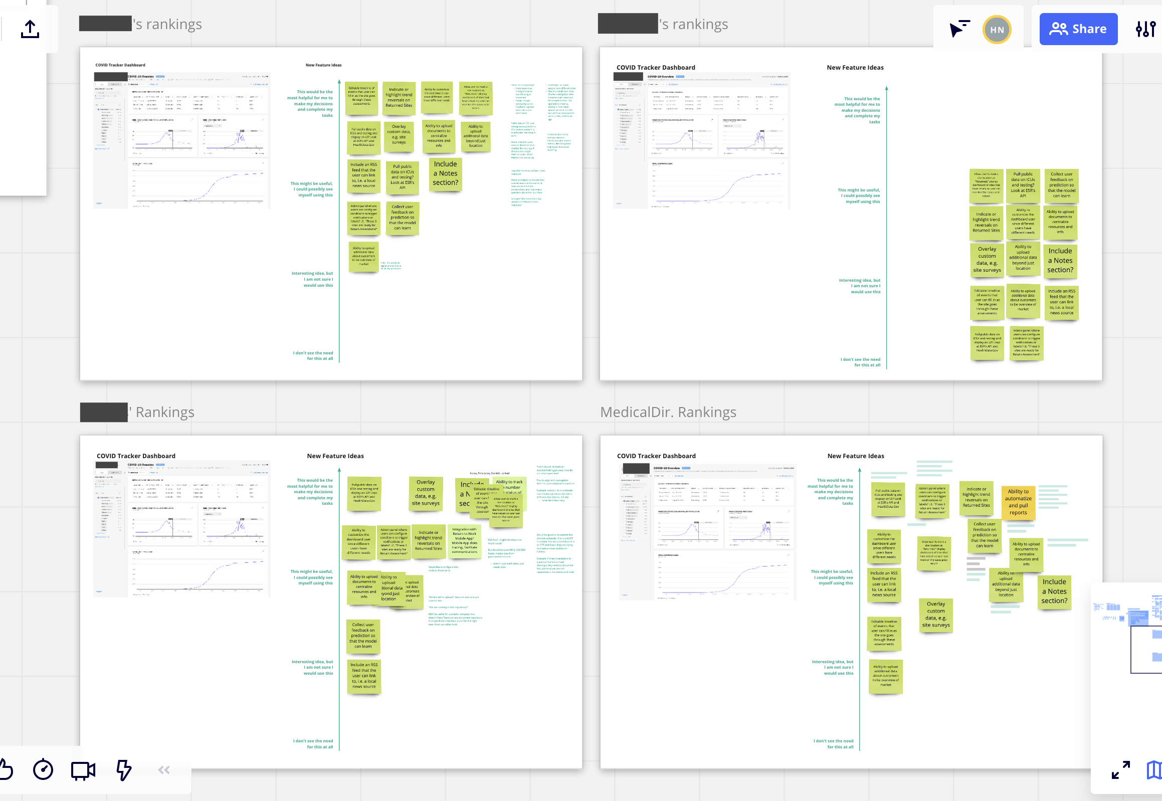
I took the ideas from the workshop, pulled out any that were low value or infeasible and I ran a prioritization exercise with the subjects of my discovery call. These exercises consisted of 2 subjects and I asked them to rank the ideas based on impact to their jobs and assessments. I purposefully had more than one person ranking them because the discussions are where you learn a lot about the nuances. It’s easy to simply rank a feature high … but if your colleague disagrees with you, you need to explain the rationale and also defend it against their arguments. I compiled these notes as well so when I presented the results of these exercises, I was able to give Product, Engineering, and Business the rationale and details behind the rankings.
As a result, we compiled a lot of data in the span of 2-3 weeks that helped the team reach a decision on features to prioritize and plant into the Product Roadmap. Because we also had Engineering rank the ideas by Effort, we were able to identify quick wins that we finished in a sprint. Those demos granted us the budget to build out those features.