Reusable Data Tables
How do we design a data table for a design system for a wide range of use cases?
Problem
It's not uncommon for UX teams to be tasked with standardizing UI patterns and design elements to impose consistency. Easier said than done, however! Our UX team split up and delegated various patterns and Ada Rafalowicz and I were assigned one of the most difficult patterns: tables.
We needed a pattern that could universally serve all use cases across all products and serve future products and features.
Our Visual Design Lead delegated specific UI elements, and we admit that when we were assigned tables, we were pretty intimidated. It was a pattern that was used on almost every product and to complicate matters further, CareerBuilder’s products serve multiple types of users: job seekers, recruiters, and HR departments. Each product contain drastic differences in use cases, user goals, and functionality. How could we create something that could be flexible enough?
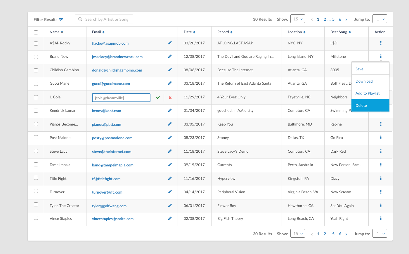
High-fidelity mockup of the data table
Solution
We broke down the table into these components:
pagination,
expanded view,
edit mode,
treatment of actions,
table customization,
cell truncation,
icon/imagery usage,
and unread/new indicators.
We split these up between the 2 of us.
Throughout the 5-week process, we met 4 times to touch base and align our efforts and thought process. After that initial meeting, we worked on the components we had assigned ourselves and just shotgunned some initial ideas for each component. We collected these ideas and then set up a meeting 5 days afterwards with an open invite to the UX team. In this “early iterations” meeting, our goal was to simply get our initial solutions out in front of as many eyes as possible. Since there were so many use cases we were not familiar with, we wanted to run these ideas through a bullshit test, weeding out usability issues, functionality gaps, and point out potential issues with our ideas. Not only was the UX team there, we also invited the main developer to make sure that our ideas were technically feasible with the resources available. We set up this meeting to avoid wasting time on designing solutions that would run into major problems in the final iteration. It also ensured team buy-in early on.
Read more
Ada and I broke down our process in a Medium post that accumulated almost 12K likes and wound up on Medium's Top 20 Posts. Read the full process here:
(Also, the article was also translated into Russian by a reader, Katya: Russian translation)