Background Check Policy Engine
How could we automate background screens but also avoid screening out candidates for the wrong reasons?
The Problem
Manually assessing candidate background tests uses a ton of time, money, and energy … and introduces human error
When a huge company mass-hires a large number of people, they have to screen every single candidate. Of course, different companies and different industries have different thresholds and policies on types of flags that could come up. For example, a fintech company is going to be more strict than a clothing retail company in the types of flags that they will tolerate. This was being done by hand, which resulted in extensive manual labor, costs, time, and potential for user error.
This client created a decision engine that would automate these unique rules. This would free up employees so that they can handle bigger and most revenue-impactful tasks and process the screenings in a fraction of the time it takes manually. However, the UI was not created with usability or design in mind so not many clients adopted this powerful decision engine.
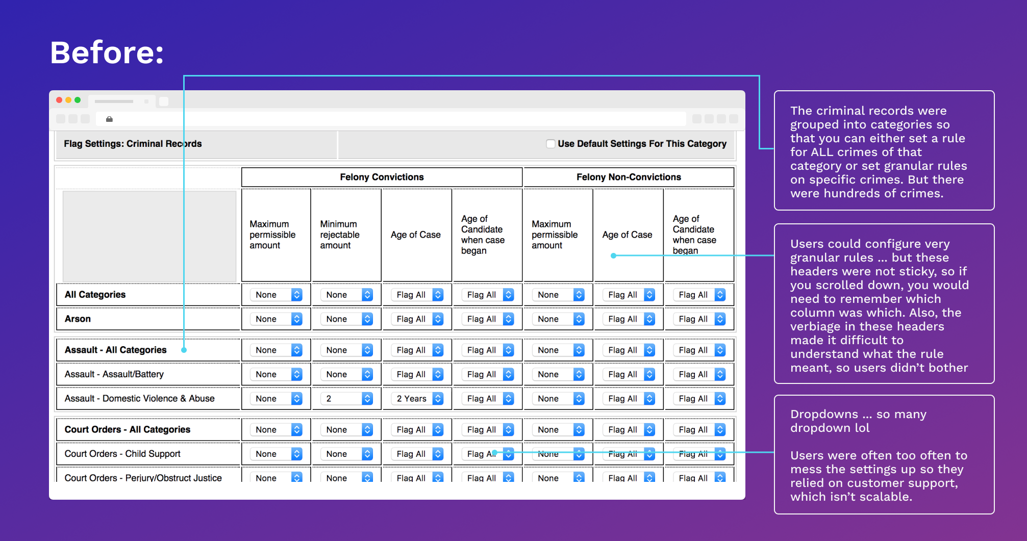
The original UI for the rules engine
What I Did
I was tasked during a design studio workshop to ideate on solutions. I consulted both the engineer and a subject matter expert and then sketched out a plethora of ideas with them, narrowed down solutions, compiled some wireframes, and then presented the solution to a panel of product, business, and compliance. I was the sole UX person and I had a day to do discovery, ideation, validation, and presentation.
Discovery
The engineer I interviewed drove the architecture and logic behind the decision engine so I needed to have a thorough understanding of how this UI worked. I walked over to the client services team and recruit one member as a SME. As someone who has worked in client services before UX, I knew that she had a wealth of knowledge. She had helped clients with configuring their policies for about 5 years.
There were some interesting discoveries as well since the SME was able to uncover edge cases and UI struggles and bring them to the engineer’s attention.

Main Usability Issues
During the design studio, we identified a myriad of usability issues, such as:
The headers were not sticky, so the user would forget the context of the columns and not know what they were configuring
The dropdowns hid all the options, even when the dropdowns contained 2 options
Halfway down the page is another header for a totally separate set of settings for misdemeanors — this was not discoverable at all
The above screenshots are just one section of a series of steps, and it was difficult for users to navigate those steps
Solutions
After understanding the general template of the logic and the rules, I decided to use a “fill in the blanks” pattern to humanize and clearly state the policy settings. Also, since not all types of flags are weighed the same for every client, I designed it so that the user can select the flag categories “a la carte.” Most of the time, clients just wanted to apply these granular settings to a subset of flag types.
Option A, Step 1: Allow users to pick out the relevant crime types so they don’t have to scroll through the full list (Click image to enlarge)
An Alternative 👇
Option A, Step 2: Clarify labels and use accordion pattern on settings page (Click image to enlarge)

Outcome
Pitched solution, got initial approval from Support, Engineers, Compliance, and Legal
I was the only designer working on this particular problem and I started the day-long design studio with zero knowledge of the background screening field and processes. Both the engineer and SME were invaluable and helped eliminate and validate my solutions. I presented the above to a panel of members from Product, Business, Compliance, and Engineering and was met with overwhelming positivity. To my surprise, Compliance was the most excited as my UI solutions were much clearer and followed the parameters we had to stay within. There was also excitement about possibly driving more user adoption of this decision engine.
Reflections
This project was from 2015 and was one of my first super complex projects. Luckily, my previous life as a client solutions consultant in the identity verification space gave me lots of experience with configuring massive, logic-heavy decision engines and adhering to compliance helped me solve this problem and present solutions in a single design studio workshop.
If I was given the chance to work on it beyond that and work on it today, I would have tried to explore alternative controls rather than dropdowns. I would have also tried to organize the settings for each flag by “Number of Convictions” and “Age of Person” and “Age of Case” to make it more clear. Also, it would have been good to also include the ability to clone or somehow copy the settings and paste onto another flag.
Even though it’s been several years, I still think back to this project and consider it one of my favorites. I enlightened me to just how harsh these background screens can be for marginalized people who apply for jobs. Months after this project, I spoke to a 60-year man during a user interview who struggled with finding jobs because of a small and non-violent misdemeanor that has followed him since he was 19. Setting up a decision engine like this could have weeded out old cases and open his prospects more. These types of challenges are painful, but necessary to solve.