What if clinical trials could get more participants by making the consenting process easier?
Problem
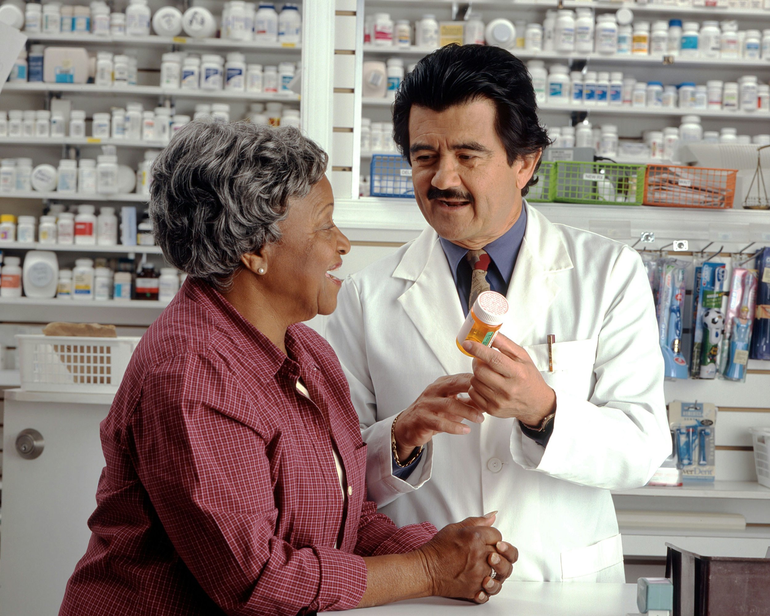
Participant dropout is one reason why medicine is expensive and clinical trials can be lengthy. This often occurs due to lengthy and tedious consenting processes. To address this problem, my product team and I were tasked with creating a new product to streamline informed consent.
Project Challenges
Strict regulations: IRB regulations on informed consent are [justifiably] strict and complex
Brand new subject area: I did not know of the regulations and workflows for informed consent
Brand new team: New product and dev team in a fast-growing startup - we were in the forming and storming phase
No frontend devs: Had to train fullstack and backend devs on how to work with UX and implement good UX practices
No direct access to users: CROs are protective of their participants so we couldn’t connect directly
Brand new market: This was a brand new market for the company so we also had to find some pilot users as we were building
Very little UX infrastructure: Also had no design system but we had to rush to market fast (that’s startup life, baby)
Had to build prototype in Prototypr, no access to Sketch or Adobe XD or Figma and the tool was very clunky
What I Did

I needed to first get a better idea of the patterns in common e-signature apps. This exposed me to the features and functionality we needed to have from both the admin and the signer perspectives. I signed up and uploaded consent forms to PandaDoc, DocuSign, and HelloSign and recorded myself going through the web and mobile experiences using Quicktime.
After that, I compiled my findings on functionality and even areas where we can improve and customize to the needs of a clinical research organization.
Interesting finding: “Handwritten signature” made it important to simulate signing. When the hand signature was not there, users in early tests were unsure whether or not they actually signed anything.
Product owners needed screens for user stories. Sales reps prepped to qualify leads. Developers awaited UIs to start development. We needed to deliver designs quickly.

Building the right thing
But how could we delivery quickly and also validate our product decisions?
Luckily, the startup employed several folks who used to work in clinical trials. I worked with Product to corral a focus group of SMEs and did discovery interviews with 4 employees that used to work directly with participant consent forms.
Interesting finding: One coworker told me a story of a participant for a clinical study with strict recruiting criteria who lived 2 hours away. She went in for a session and then left, totally forgetting to sign the new version of the consent form. Now there was a discrepancy in IRB requirements and that participant ended up falling through the cracks. This study was notoriously difficult to recruit participants for, so losing any of them could put the study at jeopardy.
There was our North Star.
This story highlighted how crucial it was for an eConsent tool to be built. It also showed that we needed versioning control and to highlight the changes to the participant.
Mobile-first design
The product needed to be as accessible as possible so that research teams could access diverse populations. We approached the product mobile-first not only because it’s good web design practice but because I wanted to ensure that the design was readable even on the smallest device.
Interesting challenge: IRB regulations limits research teams from coercing participants from signing. Consent forms needed to be written at a 6th grade reading level because the core tenet of informed consent is to ensure that the participant is fully aware of all benefits and risks before enrolling in a study.
This challnged me to re-consider common web design principles such as hierarchy, gestalt principles, and where to place visual emphasis.
For example, I had to downplay the visual emphasis on affirmative CTAs to make them more neutral.


Usability Testing
I also got to run the company’s very first user tests!
Like any startup, we had limited time and resources. Because of the accessibility requirements, we specifically screened for elderly users, ESL users, and non-tech savvy users and conducted 10 moderated usability tests. If the mobile site worked for them, it would work for the vast majority of our users.
Interesting finding: I quickly learned that we needed to have a semi-realistic consent form in the testing to trigger certain reactions. Using dummy text caused the users to just ignore the consent form and fly through the screens, which would obviously not happen in a real scenario. However, we couldn’t have a real form in there (since consent forms can be up to 45 pages!) — we needed to strike a balance.
So I looked back at our research goals and inserted verbiage in the consent form to try to provoke specific reactions.
Cross-functional collaboration
I worked with Product, Legal, and Engineering on roadmapping and collaborated on designs via workshops and design reviews. I facilitated workshops to draw out as much feedback and encouraged teams to poke as many holes into the design as possible. Working with legal also helped me understand the process of IRB approval, which helped me flesh out a process flow that informed the design of the admin side of the platform.
We ran this parallel to the UI designs that the dev team actively built. Because Product was also involved, they were able to update the user stories and update the dev teams in their standups if any changes popped up.
Product and I also worked with the sales team to connect with some pilot users to do early testing in our alpha phase. This helped me quickly validate features, revise roadmap prioritization, and get early traction on the product.


Outcome
By launching parallel tracks of design and research, we were able to:
Successfully launched eConsent tool on time
Designed workflow that was IRB approved
Designed participant-facing tool that had a high task success rate (98% in moderated usability studies)
Positive reception with pilot customers
We were also able to integrate UX into the scrum ceremonies and carve out a process with the engineering team, which helped with crossfunctional collaboration on other projects.


Lessons learned
Before this, I had mostly worked on redesign projects so a brand new product brought new challenges to me. This project taught me:
How to juggle ambiguous requirements and direction for a new market
How to form strategy around product roadmapping and assess what features need to be built for the initial launch
Integrate UX into a new engineering team that has never worked with UX before
Conduct effective usability testing to get realistic reactions, formulate specific research goals
How to use tools to help check my typography, colors, and design elements for accessibility
Building trust with alpha customers and how to extract useful, actionable feedback from them
How to teach Product how to moderate usability studies
How to work with Product to facilitate workshops on prioritization and alignment
Crossfunctional collaboration with Legal, Product, and Engineering